

I spent most of January binge watching Tidying Up With Marie Kondo on Netflix. I’m going to give myself a little pat on the back here since I’ve been doing it on the treadmill (still haven’t given up on that New Year’s Resolution!). If you’re not familiar, this reality show follows the Japanese organizing guru Marie Kondo as she tries to declutter people’s lives. I now wander around my house on a Sunday thinking about what I can throw out and what I can fold. Hubby is not happy.
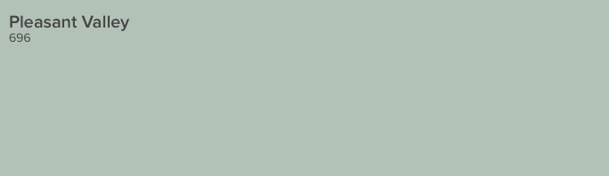
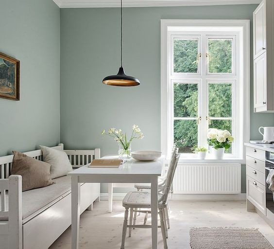
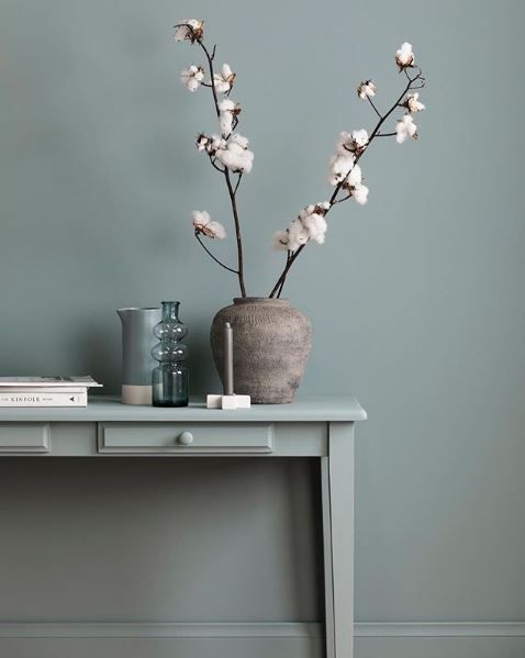
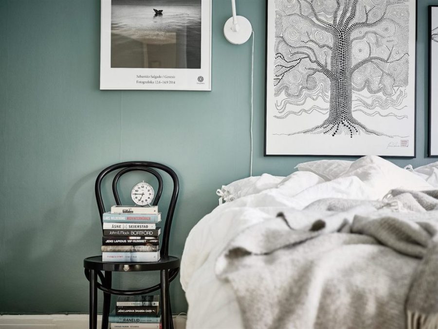
Anyway, all this talk of clean and tidy brings me to what might be my newest favourite paint colour – silvery green. I know I have a love affair with everything grey (and truth be told green is not my favourite colour) but there’s something so crisp about the rooms below!
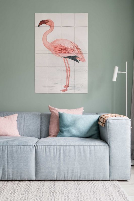
Did you know pink and green make a great pair? Throw in some grey (I can’t help myself) and you will have a stunning space like this one.
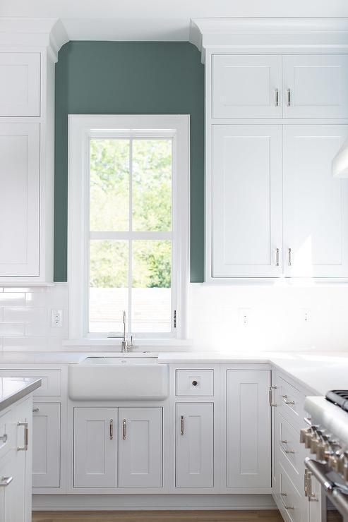
Last year we painted our kitchen Benajamin Moore Nelson Blue. During the day it looks green, at night it seems more blue and I love it! It pairs perfectly with white trim and whitewashed woods for a Scandinavian feel.

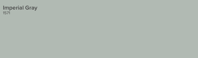
Paint colour names can often be misleading. The name says Imperial Gray but this shade is much more green in real life. For a moody space try painting walls, woodwork and furniture in the same shade (vary the sheen for interest) and use accessories for colour.
More pink and green! In the bedroom create a restful space by minimizing clutter and using a cozy wall colour like Benjamin Moore Grenada Villa. It’s romantic without feeling too feminine.


If you’re looking to a create a more modern but still relaxing space try Benjamin Moore Catalina Blue but for accents use a clean colour palette of white, grey and black.

The kitchen is a great space to experiment with colour. Since cabinets and appliances take up most of the wall space a strong shade like Benjamin Moore Caribbean Teal won’t overwhelm the room.

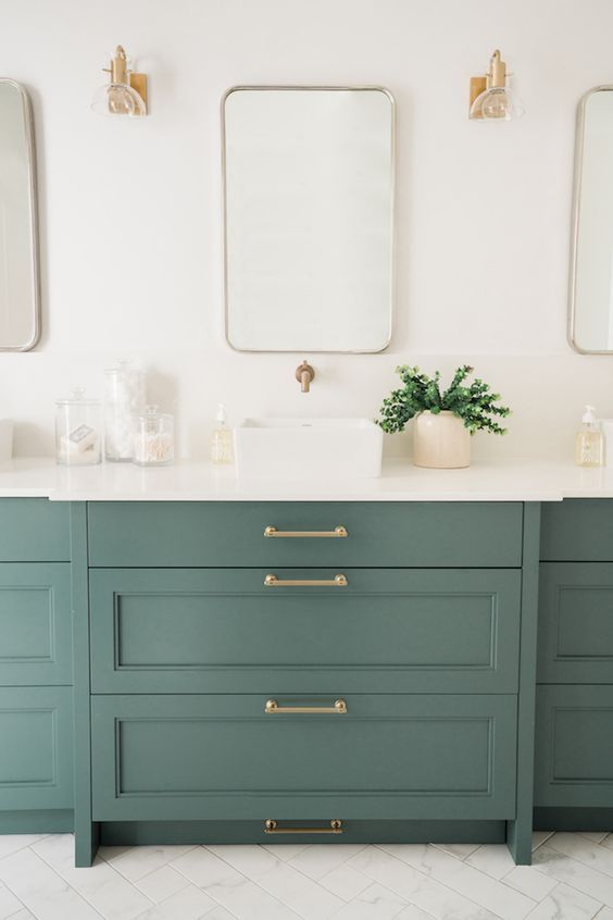
Why should your walls have all the fun? Painting the bathroom vanity is not only a great way to give your space a refresh on a budget it’s also the perfect opportunity to add a pop of colour. We love this shade of green paired with gold hardware and plenty of white.

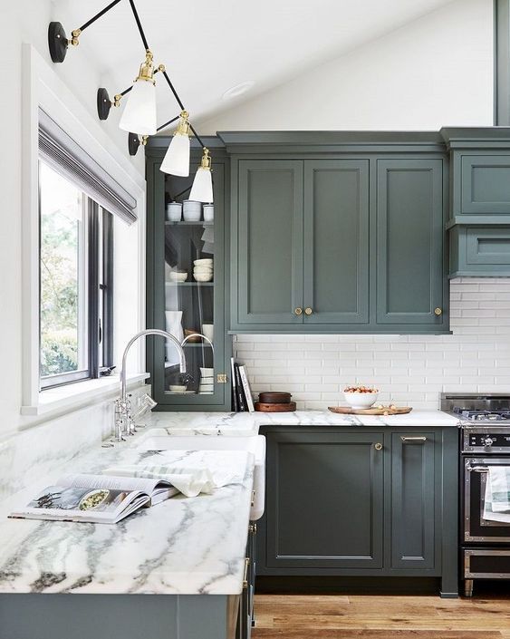
Kitchen goals? I think so! This deep grey/green is stunning on these shaker style cabinets.

Which shade is your favourite? Leave us a comment below!
There’s more where this came from! See thousand of our decorating and design Pins on our boards here. If you liked this post don’t forget to check back next week to see what’s new on the blog but if you can’t wait our Facebook page is updated daily with amazing spaces, design tips and DIY projects. Or get a sneak peak at life behind the scenes at the paint store (and more stunning rooms) on our Instagram here.
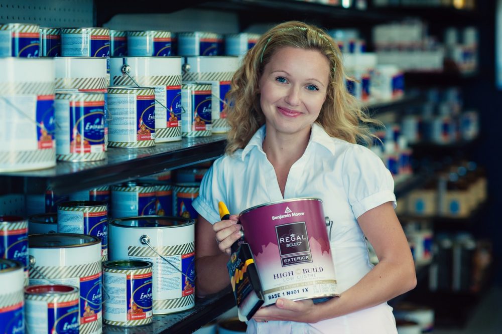 Karolina and her husband Justin De Costa took over Rowe Spurling Paint Company in 2007 after the senior De Costas, Pamela and Neviile, retired. Both Karolina and Justin studied theatre at Roger Williams University in Bristol, Rhode Island. This gave them a foundation in architecture and design while helping to fuel their creative endeavors. They continue to evolve Bermuda’s oldest paint store, providing the latest in coatings technology as well as inspiring their customers in their own home and professional projects.